OBJECTIVE
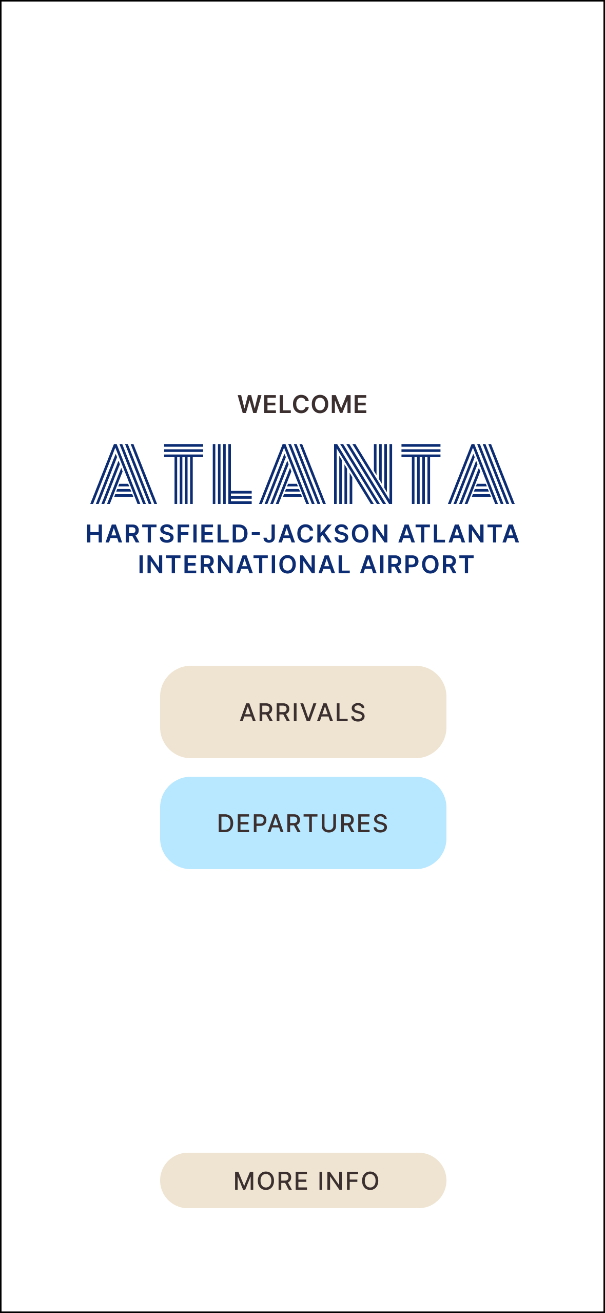
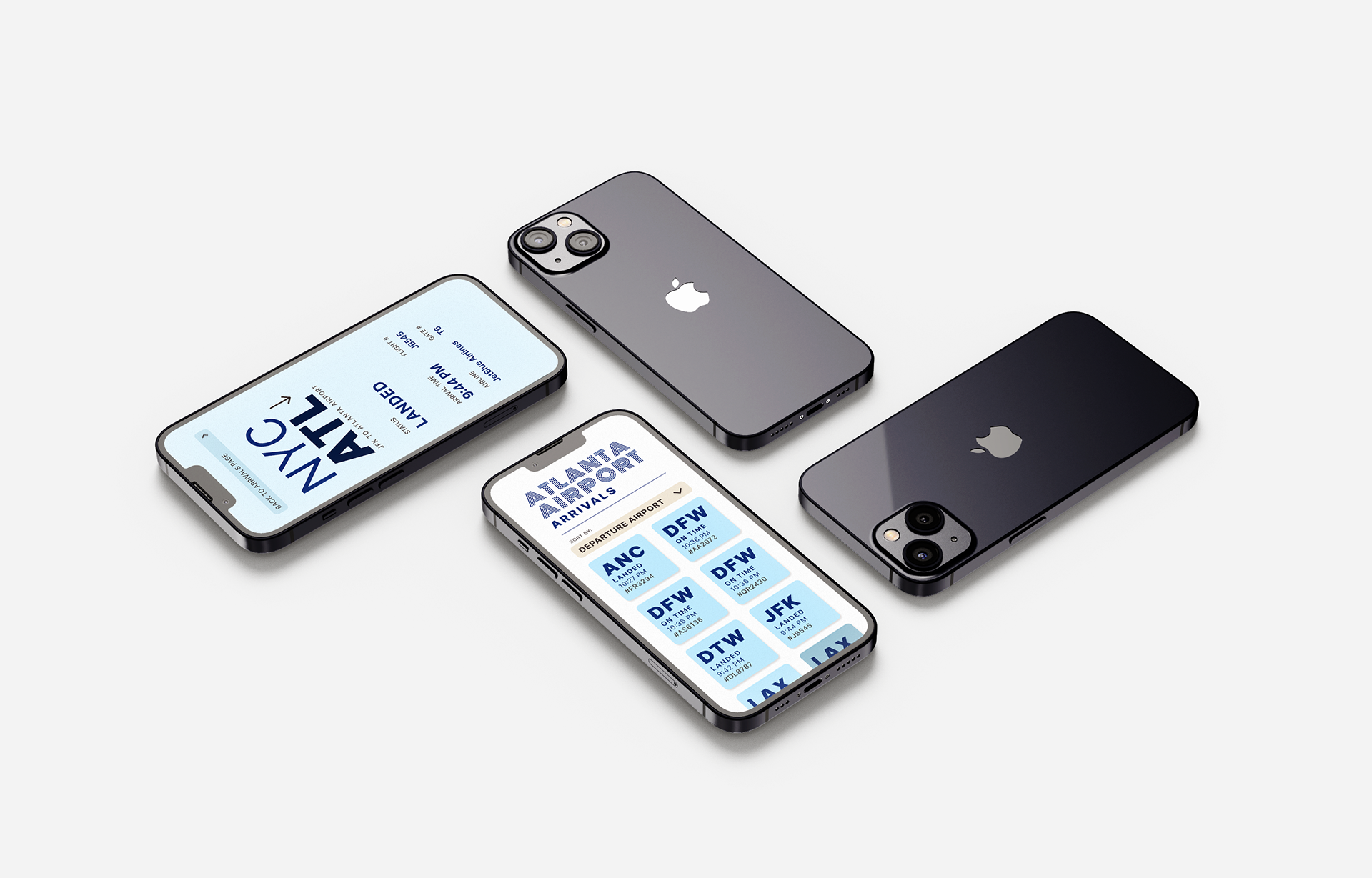
For this project, I created a flight information display system for the Hartsfield-Jackson International Airport. The design needed to clearly communicate complex information, such as flight numbers, times, and status, using visual and typographic systems.
RESEARCH
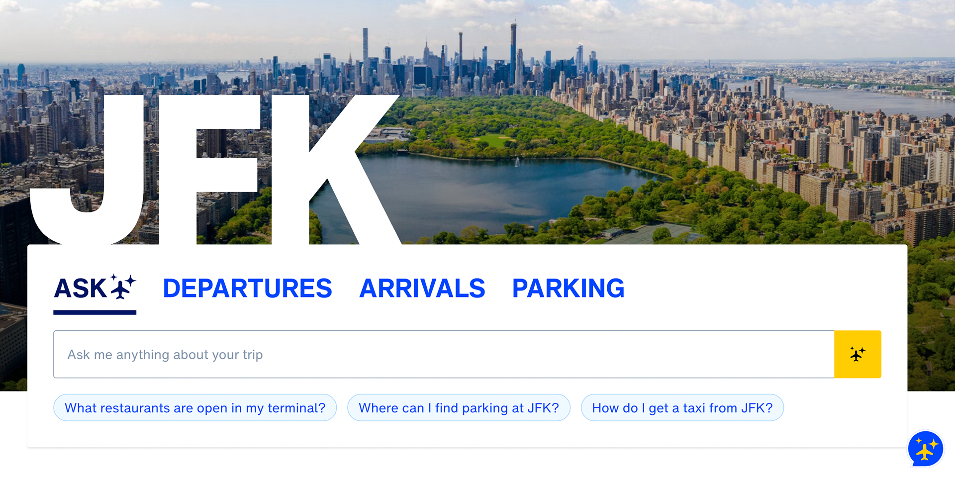
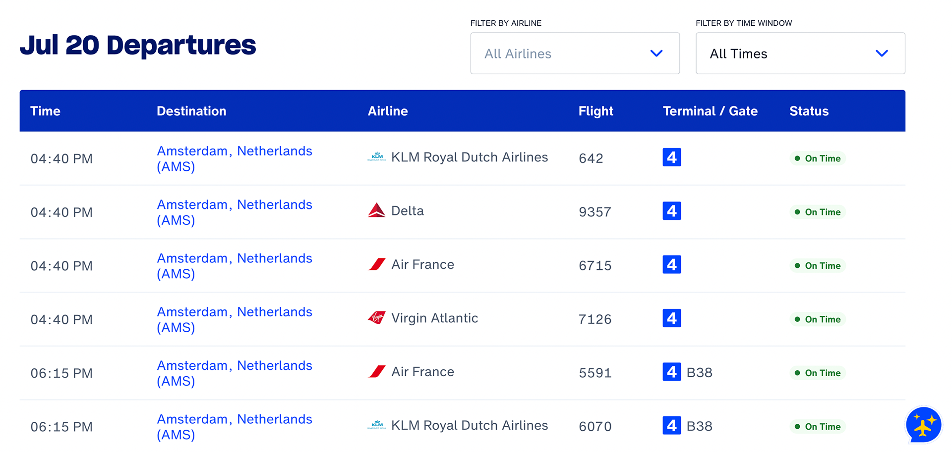
Before beginning my design process, I researched the JFK Airport interface, specifically looking for elements I wanted to include in my final design. From my research, I learned about informational hierarchy and the importance of making the gate number and flight status easy to find.
SKETCHES
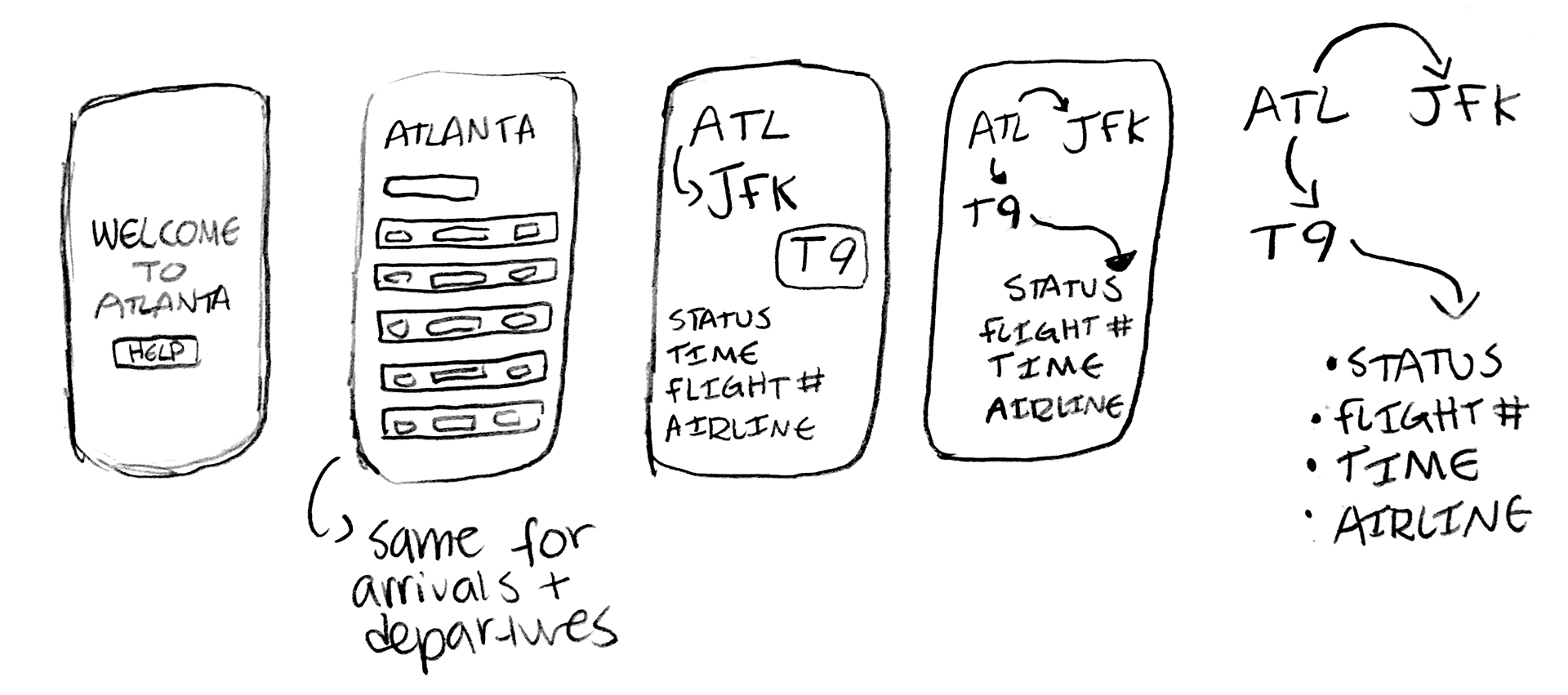
After researching, I developed physical prototype sketches for the home, arrival, and departure pages. I drew inspiration from the JFK Airport interface and reorganized each element to fit a phone screen accurately.
INTERFACE ITERATIONS
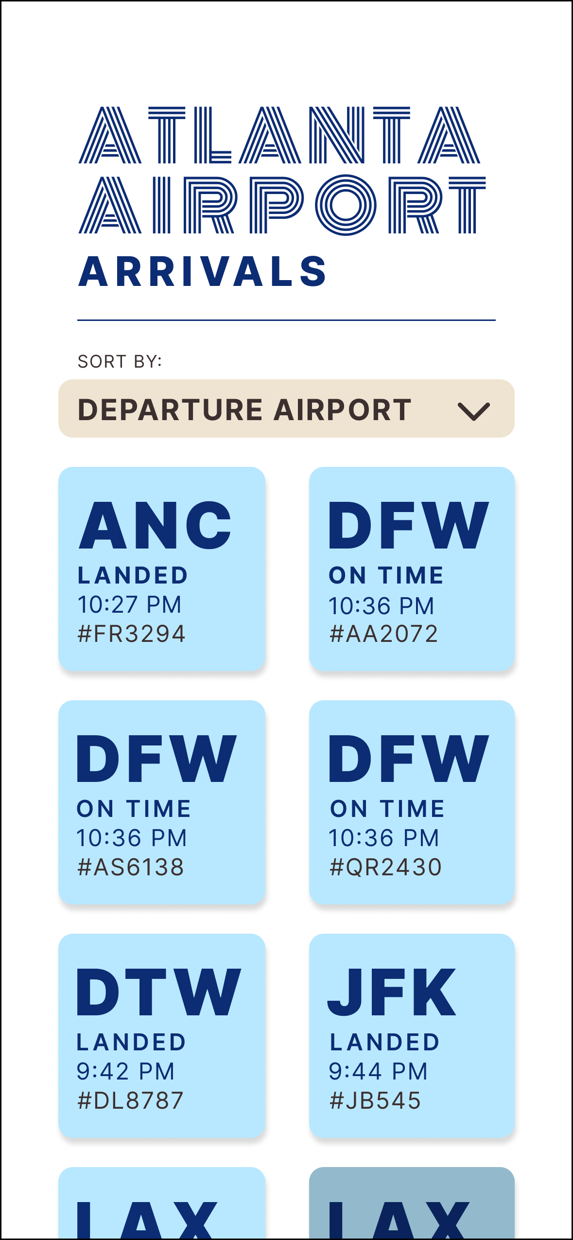
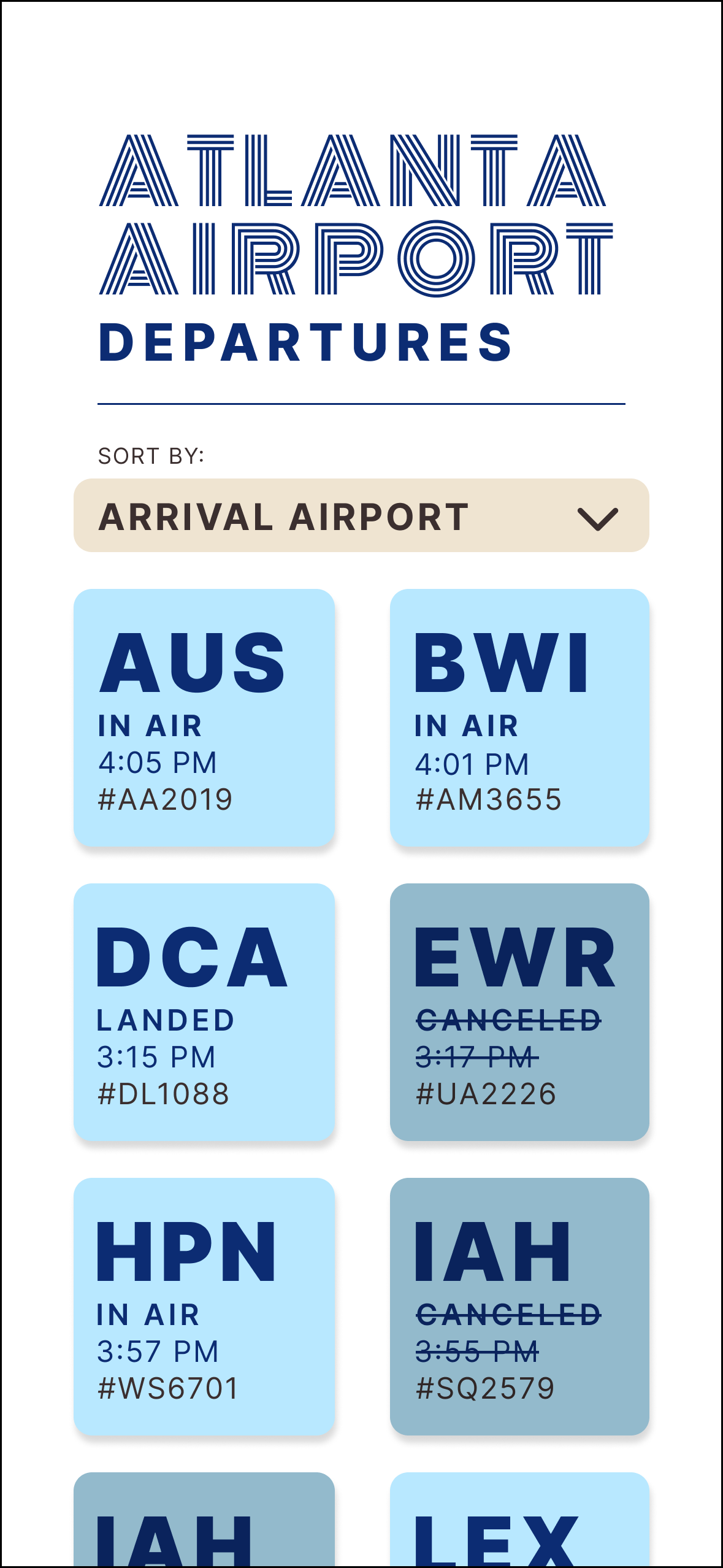
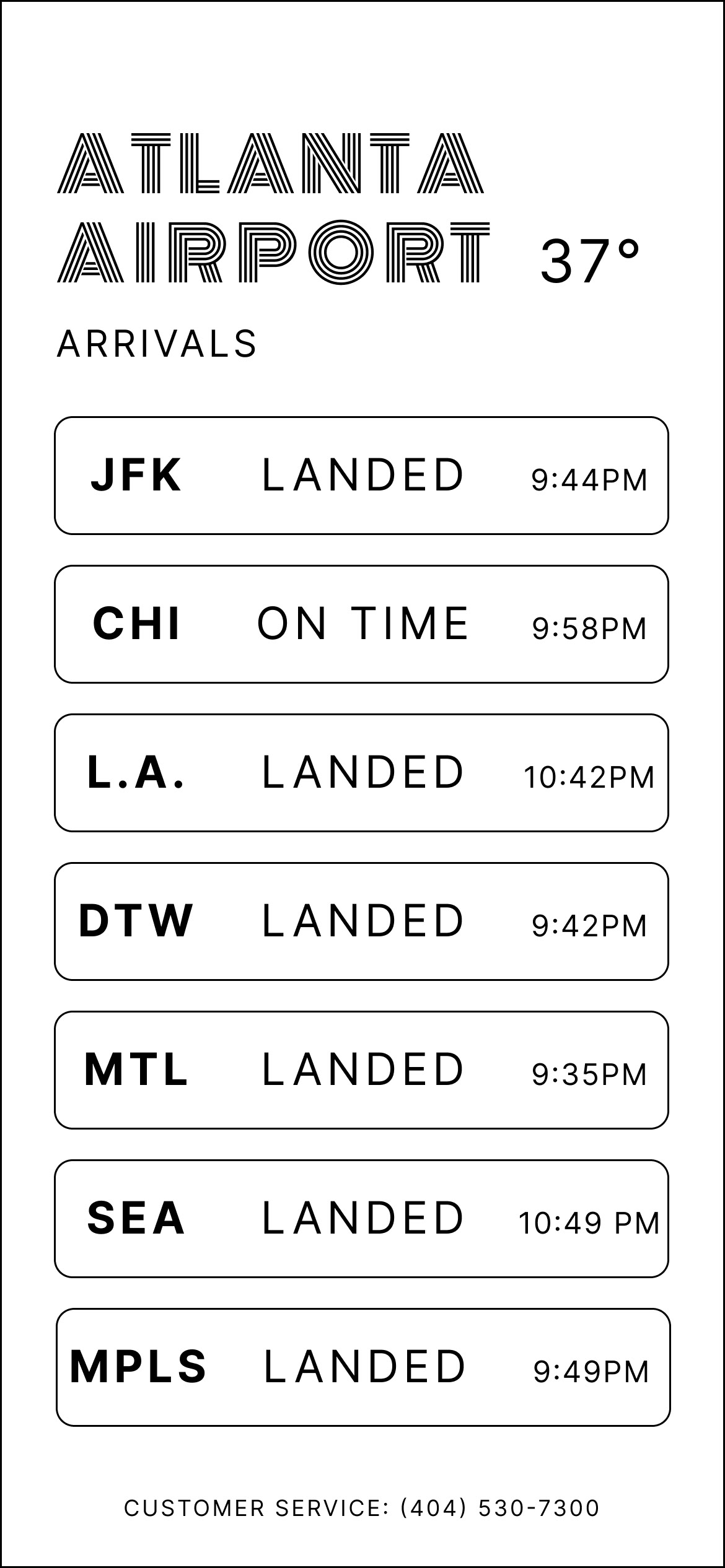
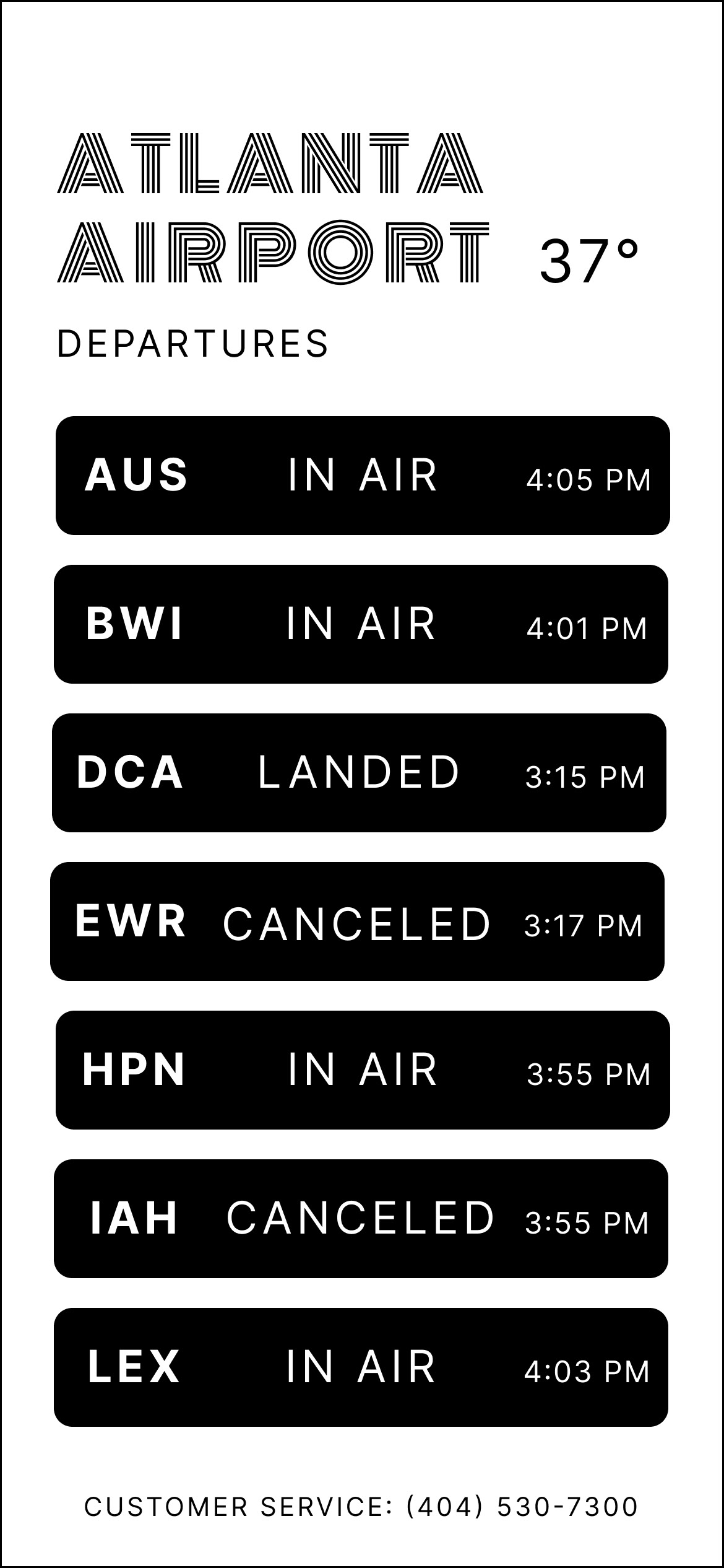
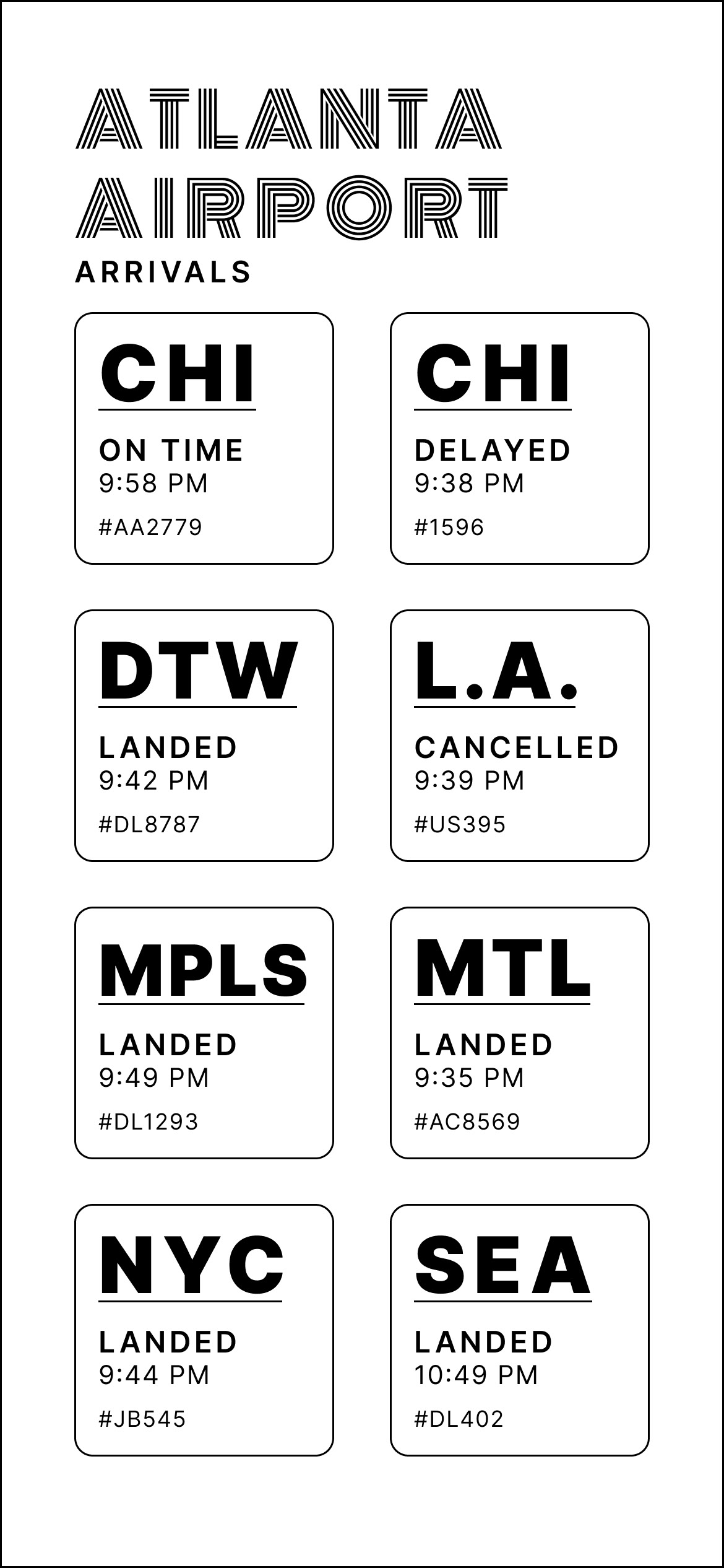
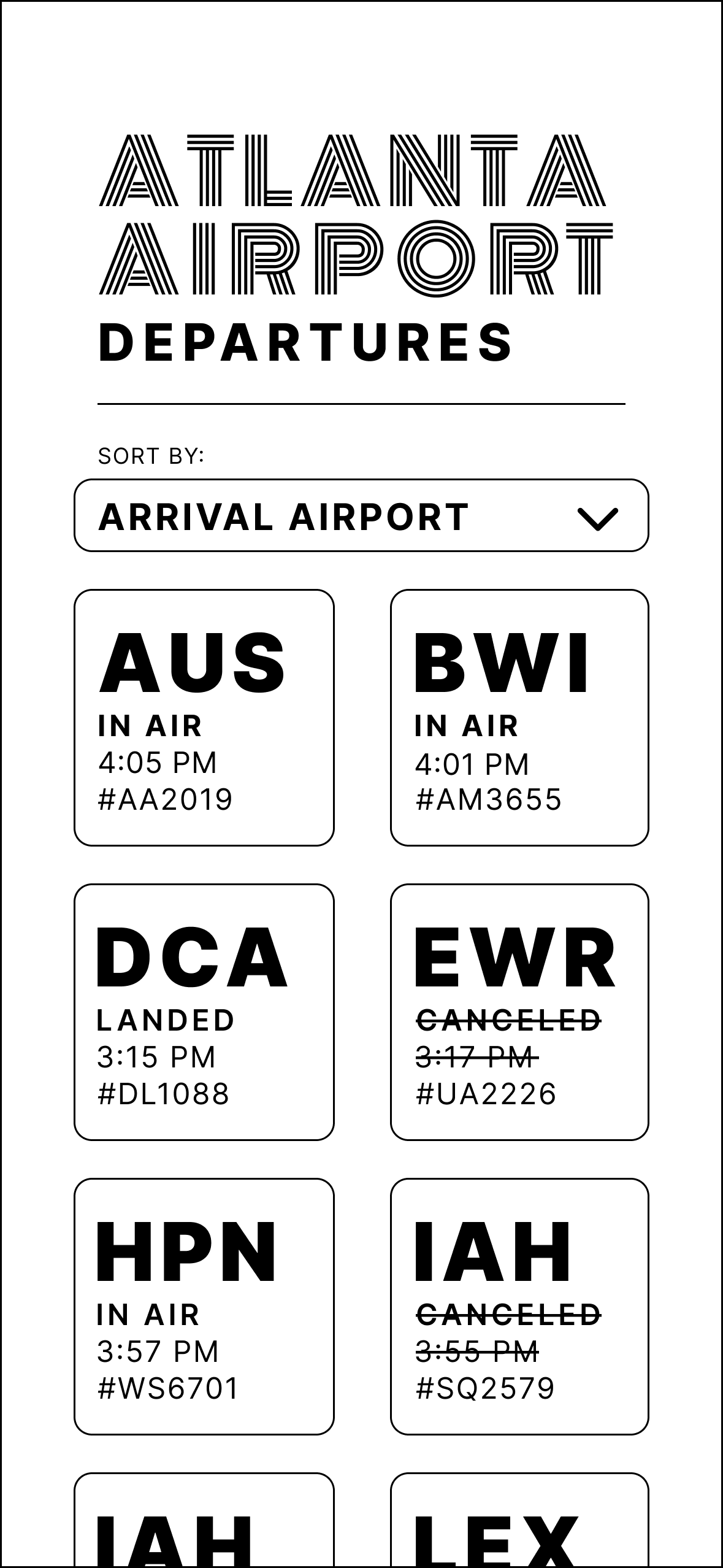
From my initial concept designs, I experimented with informational hierarchy, typographic weight, and readability. Here, I worked on my arrivals and departures screen. During this stage, I explored a square design for the individual cells, which gives a comfortable, flexible feel.
DETAILED FLIGHT INFO. ITERATIONS
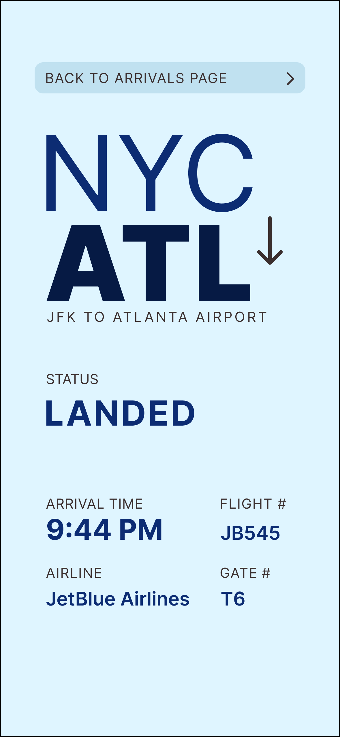
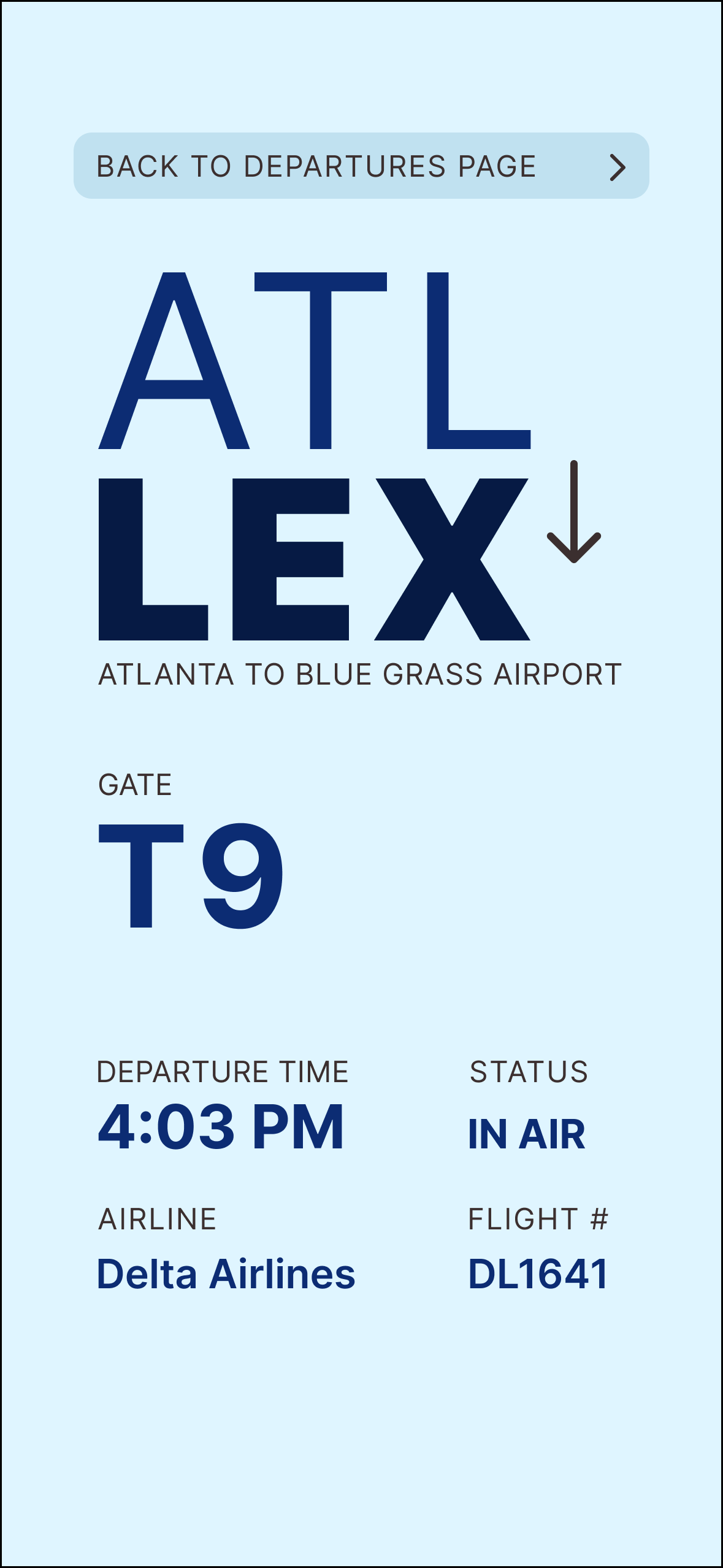
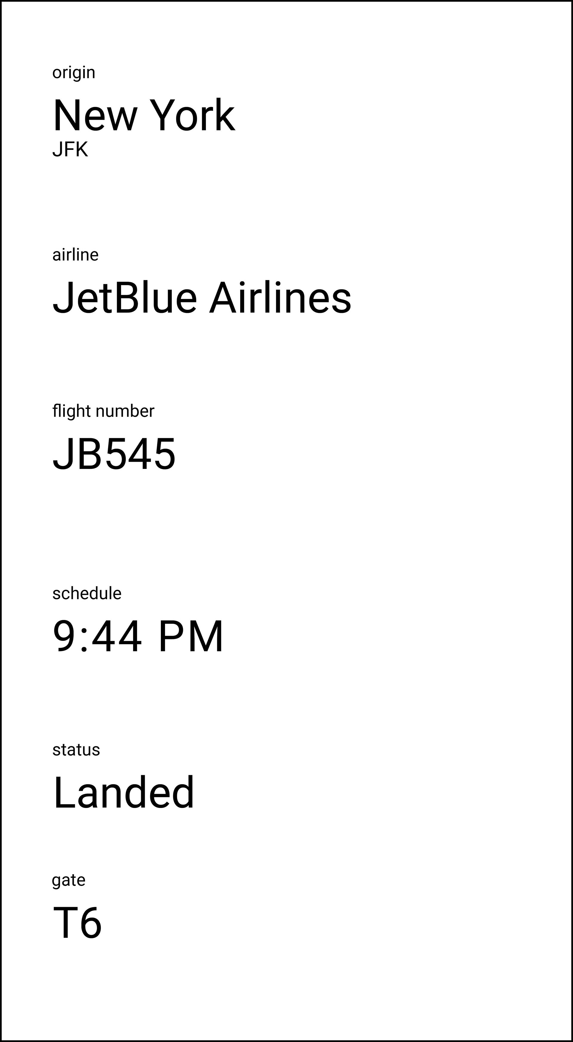
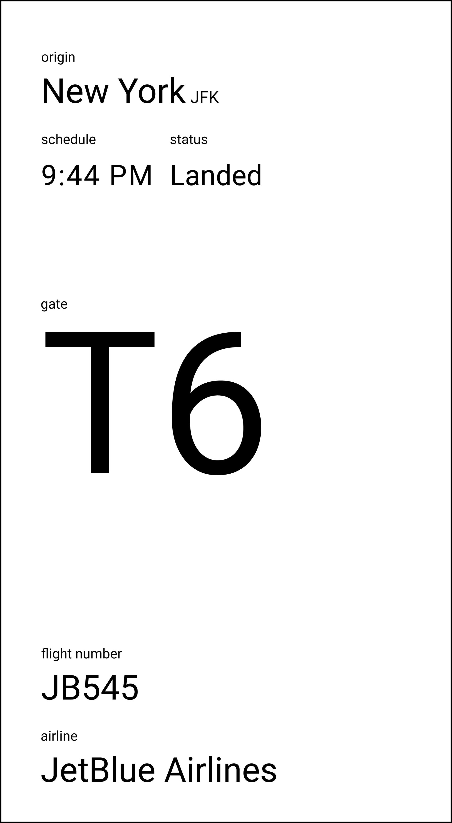
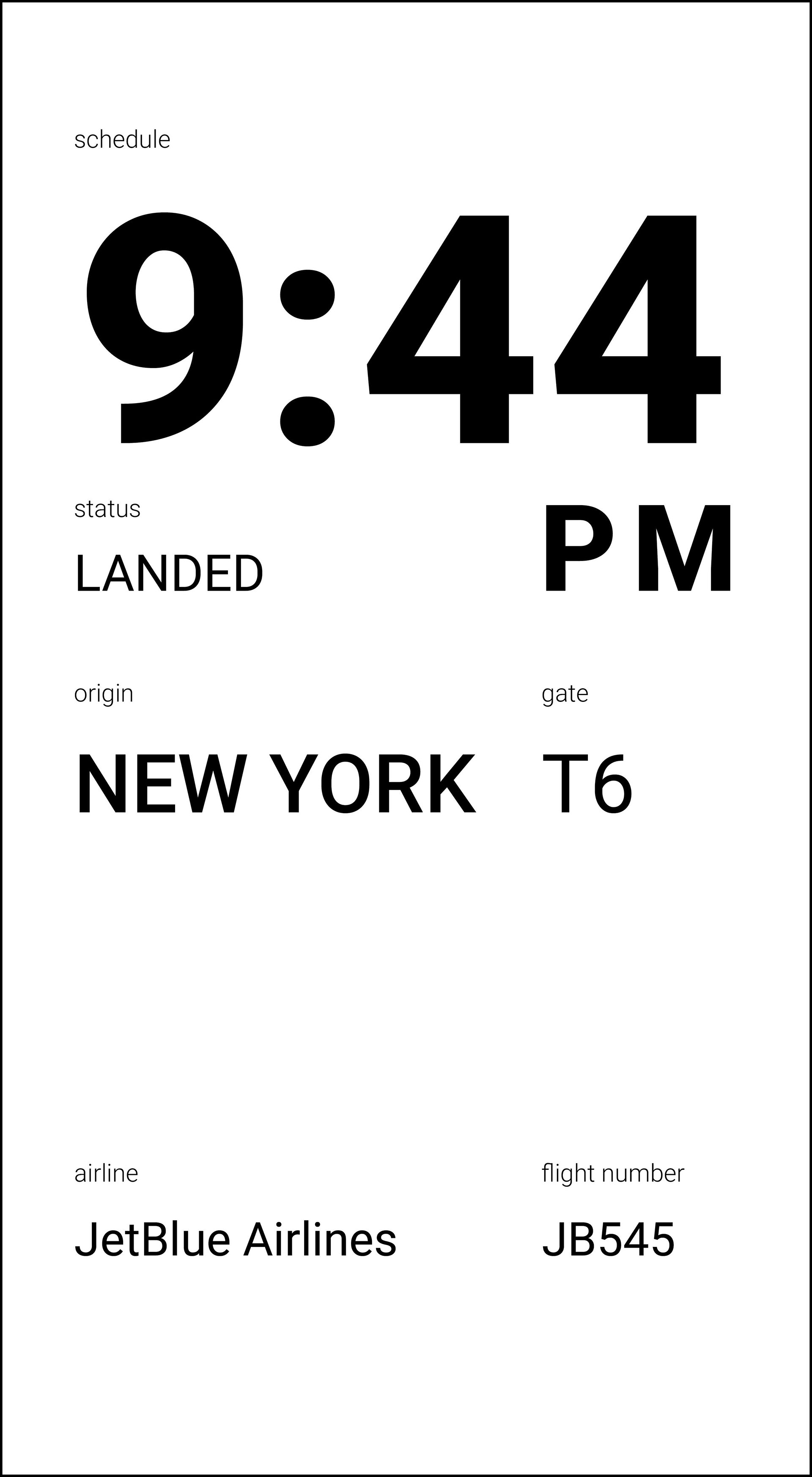
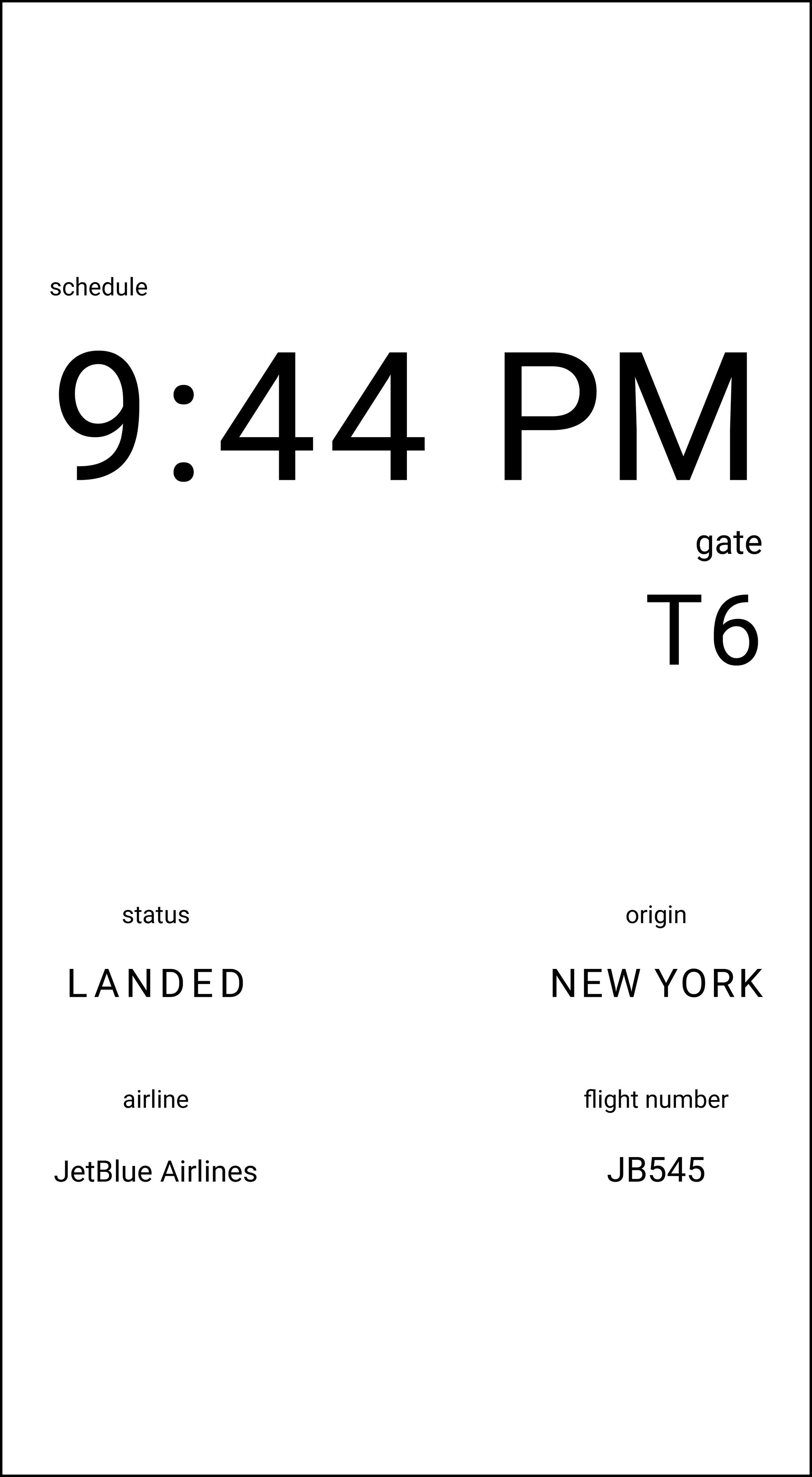
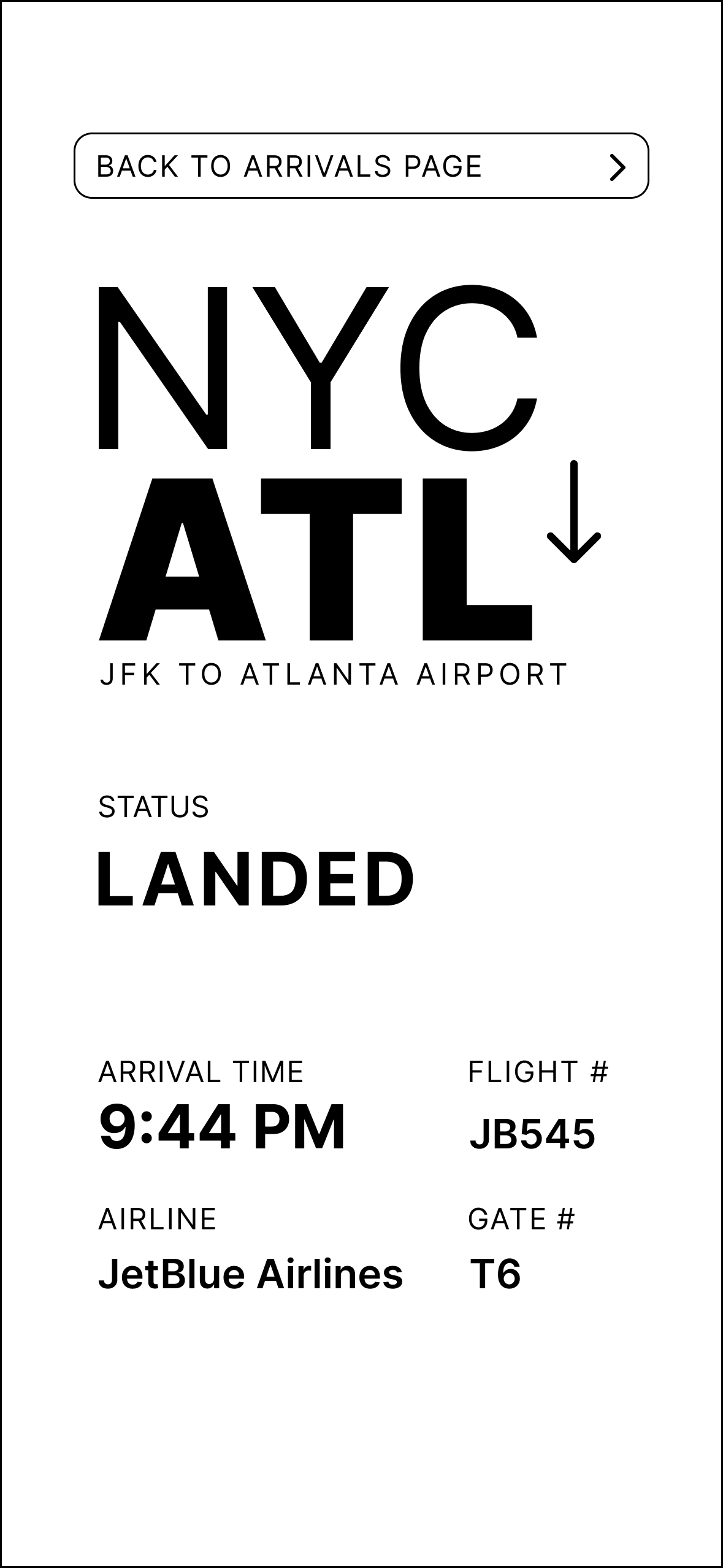
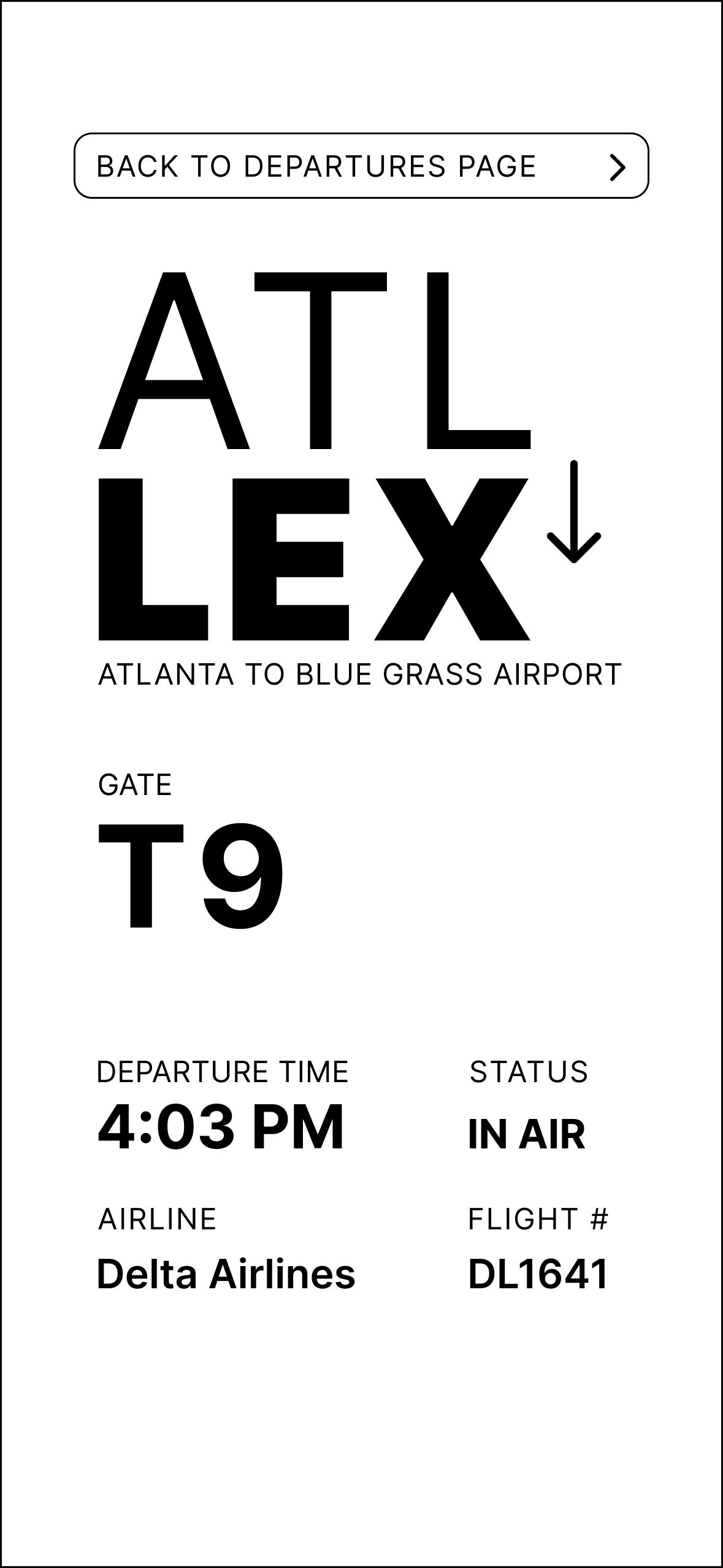
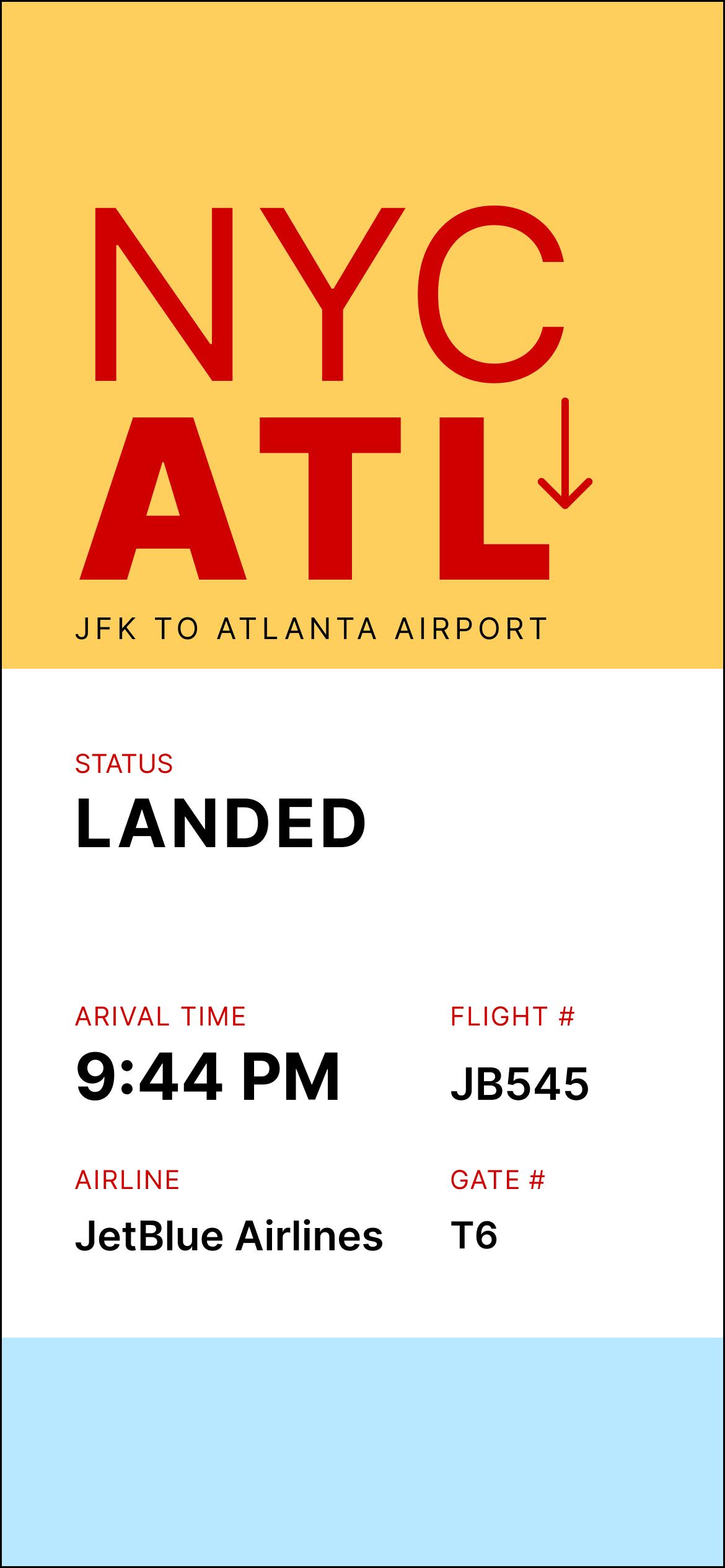
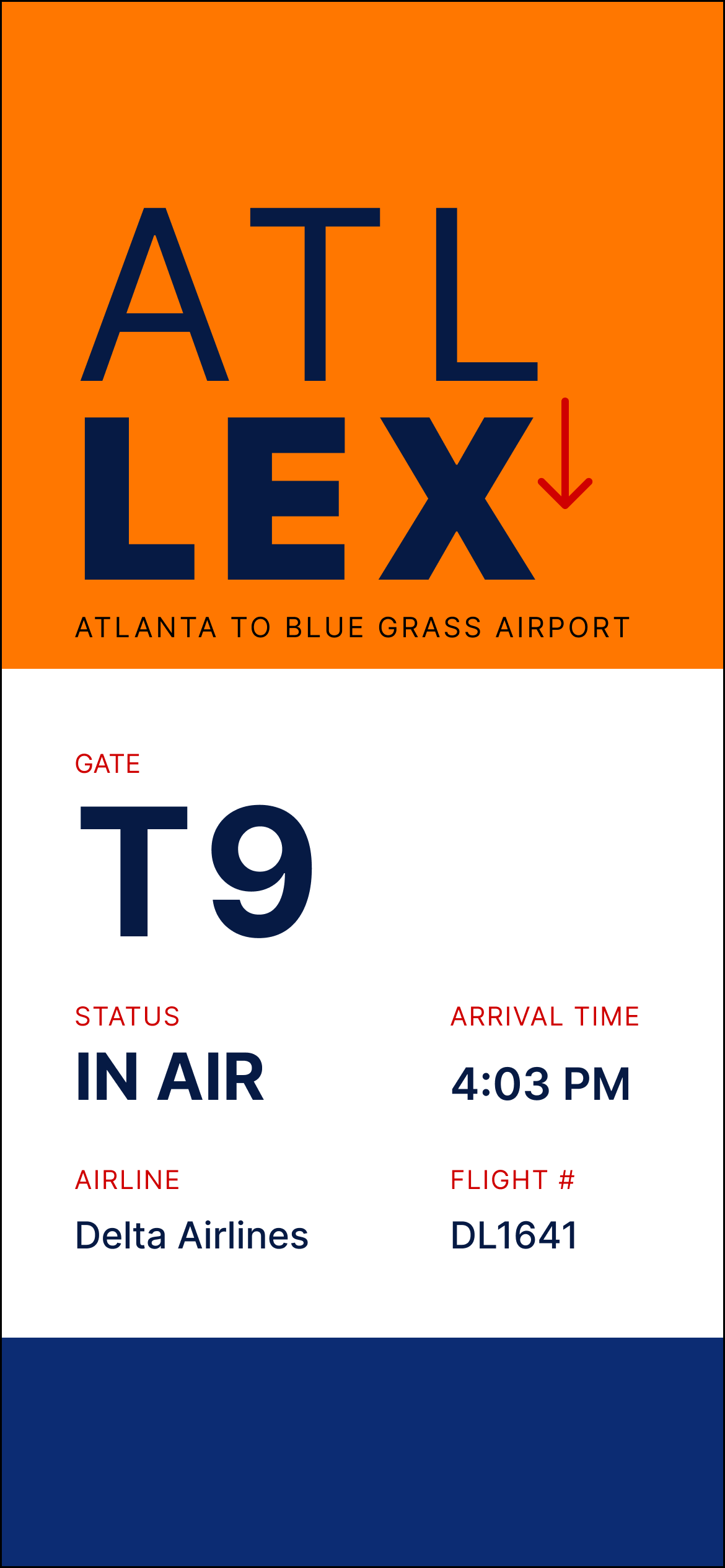
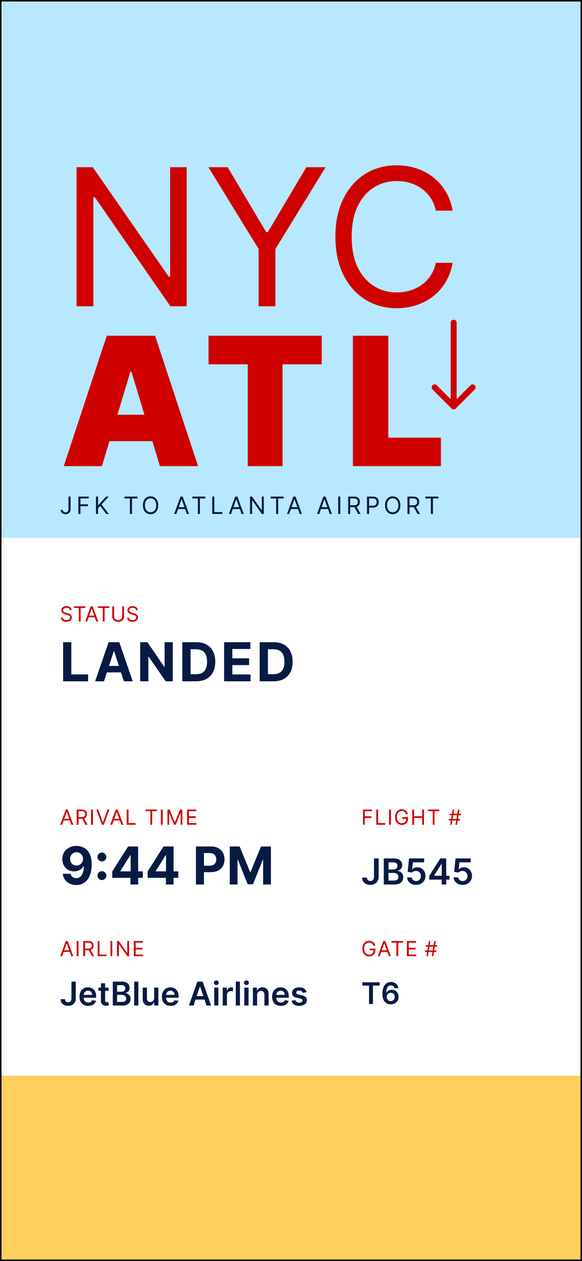
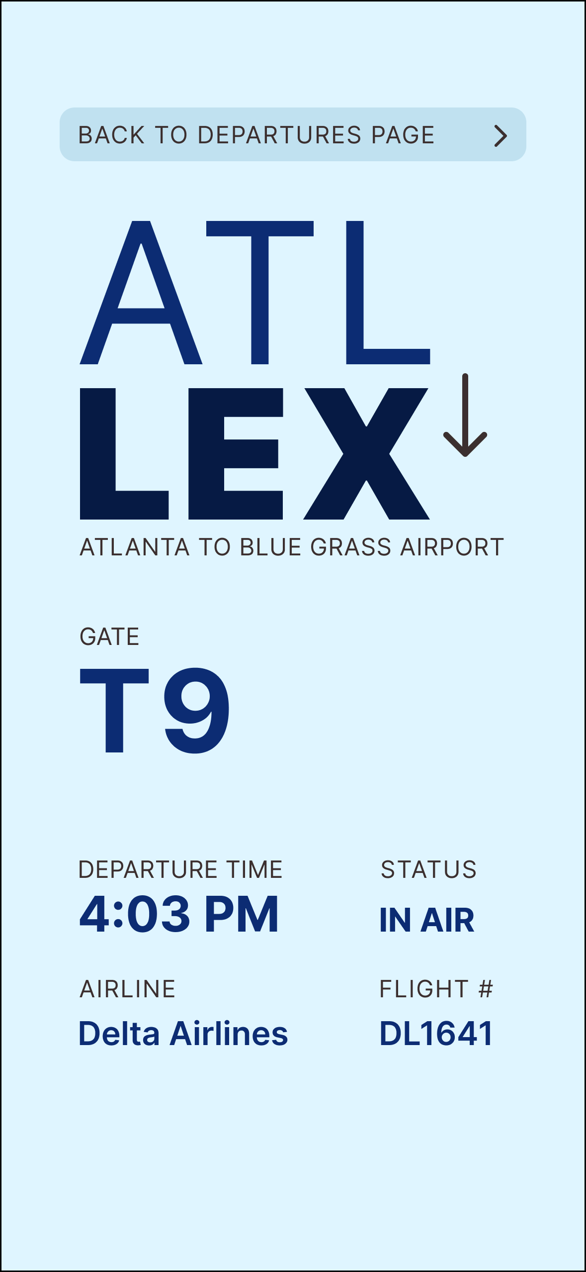
I then created several detailed flight information screens. I experimented with the placement of key pieces of information such as the flight status, time, and gate number. Overall, I emphasised the importance of flight status for arrivals and the gate numbers for departures.
ADDITIONAL INFO. ITERATIONS
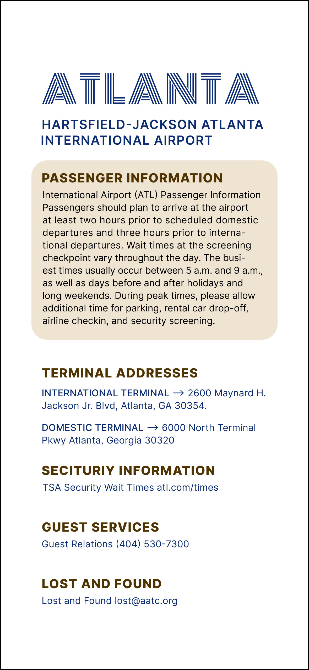
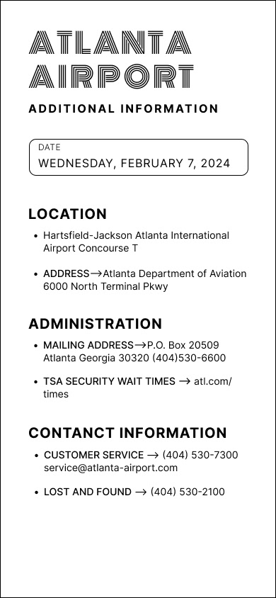
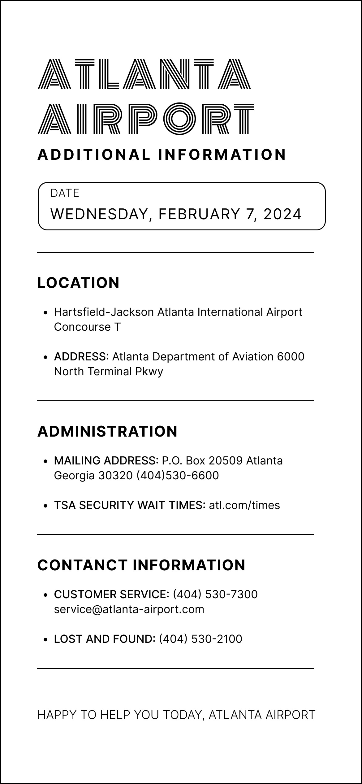
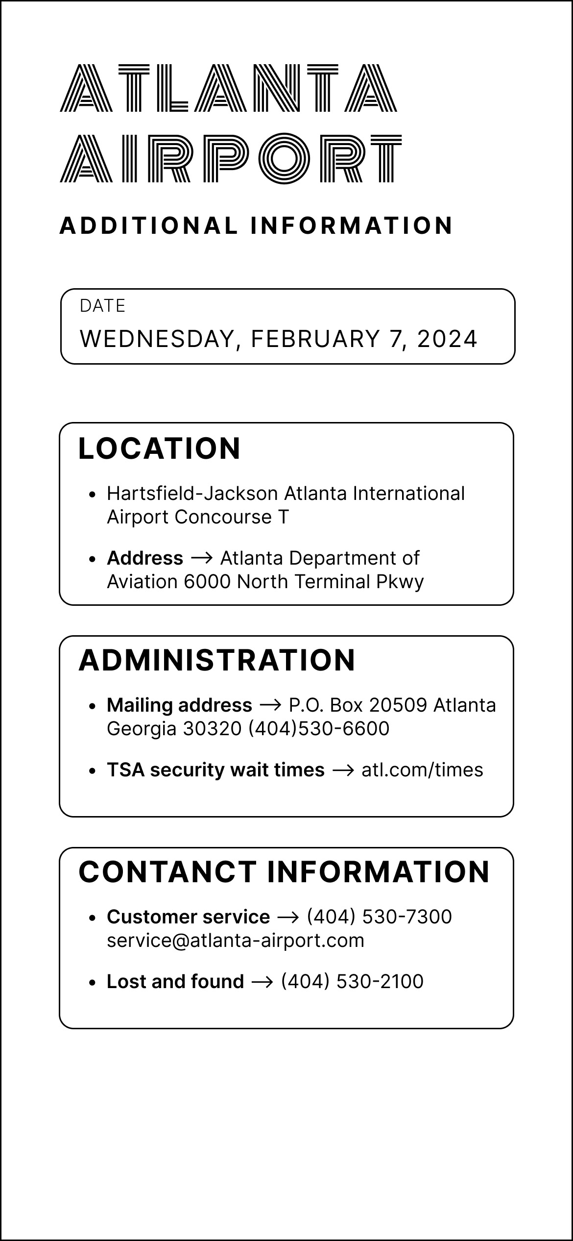
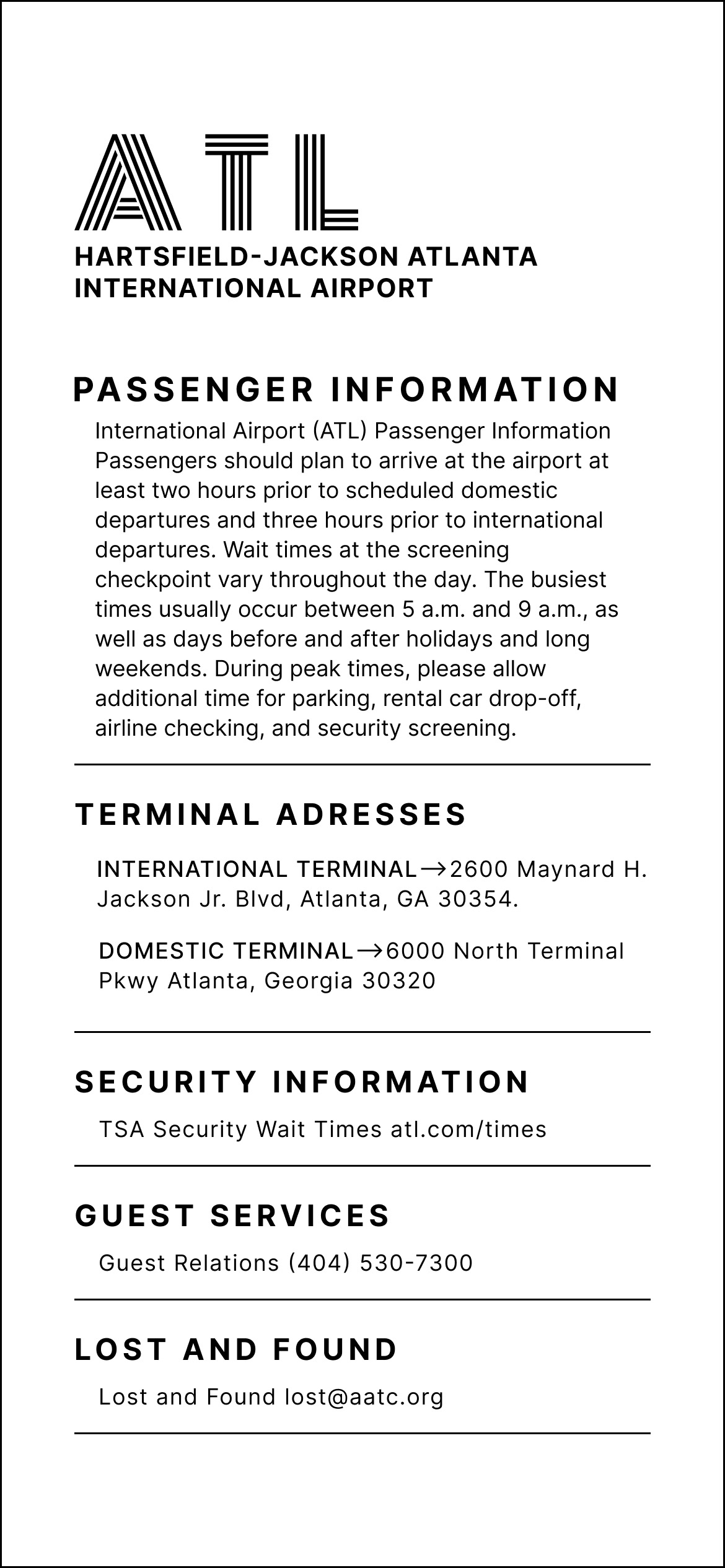
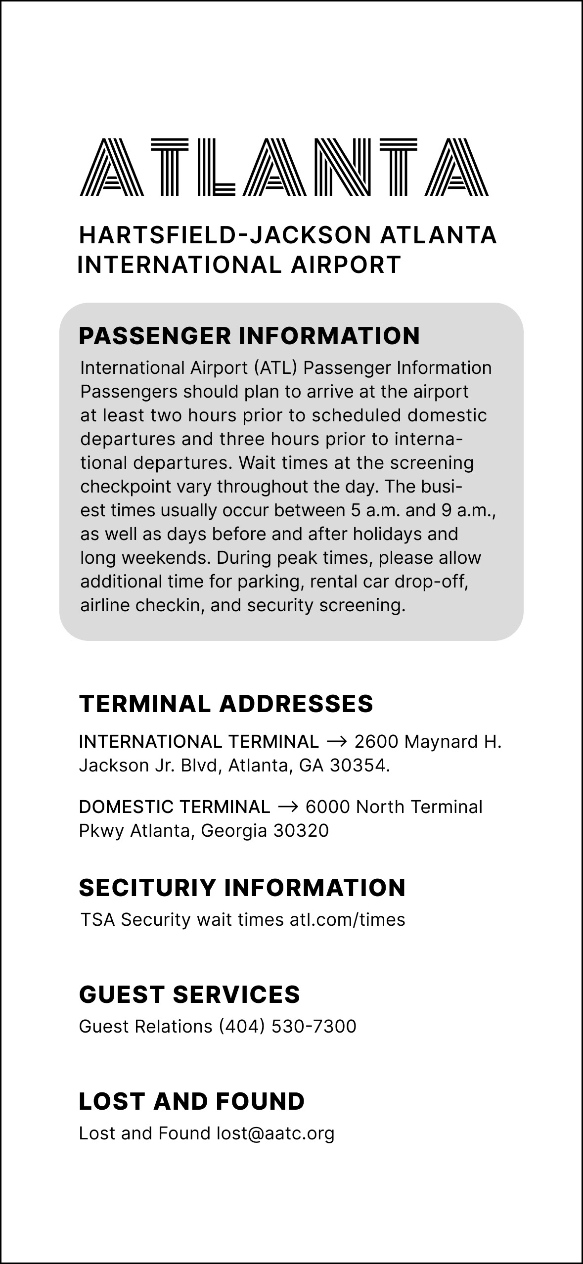
For the additional information page, I needed to organize a lot of text and information in a small space. I utilized typographic weight to help differentiate subheaders from body text. This allows the reader to easily find specific pieces of information without reading the whole page.
EXPLORATION WITH COLOR
The interface uses a brown and blue color palette. I experimented with the hue, value, and saturation before landing on the final muted tones. These colors felt the most natural and easy on the eye, considering the amount of crucial information the viewer needs to read.
FINAL DESIGN